Using JobBOSS2; Using the System; Dashboards
Dashboards - Reference
This document discusses the features and concepts of this application in JobBOSS2. The document explains the fields and buttons as they appear in the software, beginning at the top of the page and working down to the bottom.
About Dashboards
Dashboards are used to display information about your company at a quick glance. They appear on the screen when you enter your personal JobBOSS2 site, and they can be customized to show a wide variety of data. You can create multiple dashboards to showcase a range of topics, and you also have the ability to pick and choose which dashboards your employees can see.
Home Screen View

When you login to your JobBOSS2 site, the last dashboard you viewed will become your home screen. The dashboards will replace the icon page, which can still be accessed through the Order Entry tab.
Dashboard Dropdown
- Under the Data Entry tab, the first dropdown item is Dashboards.
- By extending the dropdown menu, you can see all the dashboards listed for which you have viewing access.
- If you do not have access to view any dashboards, Icon View will be the only option.
- Icon View will also be the default home screen for employees without viewing access to dashboards.
Edit Features
- Designer Mode - When in the On position, the Designer Mode allows you to rearrange the panels by dragging and dropping them on the dashboard.
- Changes made in Designer Mode are saved and updated across all users.
- Designer Mode is only available for users with designer privileges set in User Maintenance.
- Refresh - The Refresh button updates the information on all of the panels on the dashboard at once.
- Edit - The Edit button takes you directly to the editing screen for the current dashboard.
- The Edit button is only available for users with designer privileges set in User Maintenance.
Panels
Your dashboard will display four panels wide and an infinite number of panels down.
When you hover over a panel, a tool bar appears across the top of the panel:
- Date - The date displayed represents the last time this panel was refreshed. If it has been refreshed within the current day, it will display the time it updated. If it was last refreshed prior to the current day, it displays the day it last updated.
- Expand/Collapse - This button expands the panel to full screen. A collapse button appears in the upper right corner of the screen to escape full screen mode and revert back to the original panel size.
- This feature exists on the Icon View as well.
- Toggle Background Data View- This grid icon shows the underlying report data that feeds into the chart or grid displayed in the dashboard.
- Refresh - The refresh button on the panel only updates that particular panel.
- Edit Panel - The four squared button allows you to Edit, Copy, or Delete the panel.
- Edit/View Report - The bar chart button opens the report that generated the data for this panel.
- Export - The export button provides different export file options depending on the chart. For example, a grid could be exported into an excel document, but a pie chart would be exported into a JPEG.
Dashboards Navigator
The Dashboards Navigator is found by selecting the Settings tab, opening the System dropdown menu, and selecting Dashboards.
New/Edit a Dashboard
Action Buttons

Designer
This button takes you to the design page for the dashboard. Here, you can create panels and edit the layout. For more information, see the Designer section below.
Audit Trail
Audit Trail Button Details
This option displays information regarding activity that has taken place on the selected record.
- Provides the following information:
- User: Indicates who performed the Action
- Action: Indicates what the User did
- NEW: Used when the record is created
- EDIT: Used when the record is closed by clicking OK - even if nothing was changed on the record
- VIEW: Used when the record is closed by clicking Cancel
- Date: Indicates when the Action took place
- Information can only be viewed, not edited or deleted
- An Audit Trail Summary can be printed by going to Reports > G/L > Audit Trail Summary within the system.
For more information see Audit Trail.
OK
Save Button Details
This button is used to close the record and save any changes that have been made while it was open. In addition, the dropdown button allows you to Save and:
- Close - close the open record.
- New - open a new blank record.
- Print - print any of the reports related to the open record.
Cancel
Cancel Button Details
This button is used to close the record without saving any changes that may have been made while it was open. If this button is used after a change has been made to the record, the system prompts to verify whether the record should be closed without saving the changes.
Answering "Yes" to the prompt closes the record without saving the changes.
Answering "No" to the prompt leaves the record open.
General Section
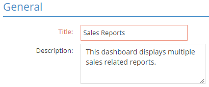
- Title - This is a mandatory field that identifies the dashboard.
- Description - The Description field is allows you to add a summary of the information contained in the dashboard. It is not a mandatory field.
Reports
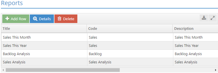
The Reports section is essential to the development of dashboards. Reports are added to this grid, and then their information can be added to panels on the Design page.
- Add Row - This button allows you to add a new report to the dashboard.
- Details - This button takes you into the report where you can add filters to the information.
- Delete - This button removes the selected report from the dashboard.
- Title - This field names the report, and the report name will carry over to the panel when you create the dashboard.
- Code - The code field represents the area of Executive Overview that will provide the data for this report.
- Description - This field allows you to enter a summary of the information found in this report.
User 'View' Access

This area allows you to select the individuals who may view this particular dashboard. Even if a user has design access, they must be given view access in order to view the dashboard.
- Select All - This function allows you to give all users access to the dashboard.
- Deselect All - This function allows you to remove access to the dashboard from all users.
Designer
The Dashboard Designer is the page where you create the dashboard. You can create panels, add report information, and configure the layout.
Action Buttons
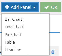
- Add Panel - The Add Panel dropdown allows you to select the chart type for the panel you are adding to the dashboard.
- If you select a table, you are limited to displaying only five columns of information from the original report.
- OK - The OK button saves your information and exits out of Designer.
Panels

Each dashboard can display four panels across and an unlimited number of panels down. Panels are moved to a new spot on the dashboard by clicking the title of the panel and dragging it to the new location. It will snap into closest designated area and bump out any panel already in that position. The four icons pictured here allow you to edit an individual panel.
- Edit Panel- The Edit Panel button allows you to change the title, report, and other fields specific to the style of chart.
- Copy - The Copy button creates a replica of the current panel.
- Edit Report - The Edit Report button allows you to change the report filters and view the information contained from the report in a grid.
- Delete - The Delete function removes the panel from the dashboard.